Monday 30 November 2015

Portraiture - Annie Leibovitz

Annie Leibovitz was born on October 2nd 1949 in Waterbury Connecticut. In 1970 she took a job at Rolling Stone magazine. In 1983 she began working for the entertainment magazine Vanity Fair. During the late 1980s, Leibovitz started to work on a number of high-profile advertising campaigns. From the 1990s to the present, she has been publishing and exhibiting her work.


In this image you see a woman very plainly sitting in the frame however for people who know the film that the picture has a totally different meaning. The fact the the background of the photo is dark suggests that there is something darker about her and her character but the lighting on her face tends to suggest that she is trying to appear innocent however the dark background suggests otherwise. The image is very simple are portrays the simple lifestyle lead by the character in the film. 


I like the fact that this image is in black and white it really shows the simplicity and innocence of both the actor and the image. I like that the colour of the swan contrasts the colour of the actors shirt. I like that apart from the swan the rest of the picture is in very dull tones and is very linked in to each other. I feel that the fact he his showing a deadpan look and isn't really giving away any emotion. I also like the fact that he is not in the centre of the picture because it really shows off the background of the picture. 


I like that in this photo all the shades are of similar colour and all appear to be very earth and natural colours this really links the setting and the photograph together giving the picture the feel that she is supposed to be there. I like that she isn't looking at the camera and appears to be looking off into the distance. I like that this is a full body portrait but she is sitting down with one of her legs up meaning that the photographer was able to be closer in to the models face but still keep most of her body in the photo. 

Friday 27 November 2015

Straight Images - Portraiture Location


Contact Sheet - Portraiture Location


Work Diary - Portraiture Location

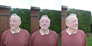
I missed the lesson on Thursday afternoon however I was told that the lesson was to do with taking portraiture outside. For this shoot I decided to take photos of my Grandad because he has a very interesting face because of the wrinkles and creases in his face. I feel like he made an interesting subject because I took a younger person in the studio I wanted to contrast this with someone from an older generation to see the different ways in which they could be photographed and if they are different in anyway. I also decided to try and use some different and interesting editing techniques to make the photos look even more interesting.  The editing techniques that I used were very simple however I used them in a interesting way to make the portrait look interesting. I changed some of the photos or bits of the photo to black and white to helps show the age of my Grandad and show that when he was first born he would have been photographed in black and white but now he can be photographed in colour.

Below is an edited photo from the shoot that I like
Camera Settings - 1/125 sec f/4.0 ISO 320


 Camera Settings - 1/125 f/4.0 ISO 280 
I like this photo because the editing worked really well and I enjoyed spending the time making the split in the photo as equal as I could I also really like the photo I feel like it was taken at a good angle and the expression on his face is very natural and not forced making him seem more relaxed in the photo and I like this look because I personally do not like photos that are being posed for and I feel like the editing works well with the photograph.

Below is a photo from the shoot that I don’t like


Camera Settings - 1/80 sec, f/4.5 ISO 400 

I don’t like this photo because it is not a portrait photo as it is taken landscape. I also am not happy with a the framing as I think the background looks rather flat and all one colour I prefer the photos where the shed if featured in the background as I feel that the shed gives the photo some depth and really helps add to the colour of the photo. I also don’t like this photo because I had decided to use the flash on my Grandad and it blinded him causing him to make a strange face which I do not like.

Progression

If I were to go out and reshoot portraiture outside I would like to have someone who is old and someone who is young together in order to make a really interesting portrait to show the difference between the ages of the subjects and look at different editing techniques for the photos. I would like to learn more editing techniques so I can continue to improve my photos.


Tuesday 24 November 2015

Straight Images - Portraiture


Contact Sheet - Portraiture


Work Diary - Portraiture

In the morning lesson we were tasked with take portraits of other people within the class and looking at different photographers that take portraiture photos. I enjoyed look at the photos and different ways in which the portraits were taken. When I went in the studio and took the photos I found this part fun however it was hard at first to get the model to show the right emotion as I wasn't exactly sure what look I was going for so I struggled with this bit to begin with however after a while i got the hang of it and managed to get the look I was going for.

Below is a photo from the shoot that I like
Camera Settings - 1/125 sec f/8 ISO 200


I like this photo because it is a really simple portrait and I edited the photo to help show the emotion in the photograph and shows the sadness in the person and the photograph. I like the position of the lighting and the simple nature of of the photograph. I like the dark tones of the photo as it add to the emotion of the photo. 

Below is a photo from the shoot that I don't like 


 I don't like this photo because it isn't straight on. I don't feel like this is a strong photo because I feel like it shows depth rather than portraiture. I think that this photo would have looked better if it was straight on and I feel like this is a weak image and it could be made stronger if I took it from straight on and made her look up rather than lowering myself. 

Progression 

If I were to go and reshoot portraiture I would like to do it with a range of people with different backgrounds to get used to taking group photos and getting the right background for certain people. I would like to also try taking portraiture at different angles and heights in order to get the best photographs. 


Image Bank - Portraiture


I like this photo because the facial expression adds to the theme of the photograph and really shows off the mood of the photo. I like the fact that the image is well lit and bright and there is a clear contrast between the colour of his shirt and the background colour. I like this photo because it is a really clear portrait and you can really see is facial expressions and it really adds to the tone of the photograph. 


I like this portrait because the pose that the guy is doing it extremely simple but works well because even though he is smiling he has a mysterious look about him because of the angle at which he is photographed.  The contrast of colour also works well and gives an air of mystery to the photo. The lighting of the photograph is bright and allows you to see all the sides of his face well as the lighting has been well placed. 


I like this portrait because the subject is not looking the camera and doesn't even appear to know that the photo is being taken. I like that you can see what he is looking in is glasses yet you can't work out exactly what he is looking at. I like that this photo isn't it the studio because I feel like it give you a better idea as to what he is looking at. 


I like this photo because it a portrait photograph that has been taken as a landscape. I like this photo because it is a young and shows the innocence in the photograph as the boy is all on his own and looks hurt adding to the innocence. The fact that you can't see his expression and he isn't looking at the camera means that it is hard understand exactly how he is feeling and what he is doing this adds an air of mystery to the picture because you don't really know what is going on.


This is a very simple photograph yet is it extremely effective as she is looking directly down the middle of the lens and it looks like she is looking directly at the person looking at the photograph. The portrait is clear and I like that the background is blurred and this also helps her stand out and makes it clear that the photo is all about her. 


I like this photo because it is a really dark and shaded photo of the lady and the dark tones add to the feeling of hurt and sadness which is also shown through the plaster on her face. I like that the photo is taken side on and really shows off the emotion in her face as it can be seen through both her eyes and her mouth. I like that photo has a dark background as it really makes her stand out and adds to the tone of the photo. 

Definition Post - Portraiture

definition - a painting, drawing, sculpture or photograph of a person or group of people, showing of the expression of the person. Its intent is to display the likeness, personality and mood of the person. 


The person in the picture is looking directly at the camera and there is a clear expression on her face which shows the emotion in the photograph and that it is meant to be a happy photograph. This photo shows clear portraiture because the girl is in the centre of the photograph and she is the only thing in the photo. 


In this photo the person is not looking at the camera giving the idea that she is moody and her facial expression is very harsh. The fact that she isn't in the centre of the photo really gives the idea that she doesn't want to have her  photograph taken. The angle of her face and the fact that she isn't in the middle of the photograph really help adds to the mood of the photograph.


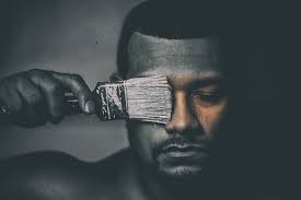
This portrait really gives a different message. It gives the idea that people are not always what they seem. In this photo the man has a deadpan look, showing no emotion, so as not to take away from the message of the photograph. These portrait is lit  from the left hand leaving the right hand side of the photograph and full of mystery. 


This photo is taken in a location really giving and idea as to why she is happy and you can guess what she is taking a photo of, the red lighting gives the idea that she in a dark venue and it is only lightly lit. The fact that she isn't in the foreground also helps the viewer to understand where she is and what she is doing.


Thursday 19 November 2015

Straight Images - Photojoiner


The images that I created for this topic are very similar to ones that I researched when completing my image bank. I feel that by having a clear base of images that  I had looked at allowed me to understand the way in which to make them  successful. In some off them I pushed the composition more than others as I used some images that weren't straight and this challenges the composition of it as I was trying to make them all match them all up in different ways in order to make the image look interesting and highlight the fact that it is multiple different images laid over the top of each other in order to created a new and interesting image. Some of them worked better than others, I feel that the ones of people didn't work that well as it was hard to match up the images and make it look like the person whereas in the others it was rather simple and worked effectively. 

Contact Sheet - Photojoiner


Work Diary - Photojoiner


Below is a photo from the shoot that I do like 
This week we were tasked with creating photojoiners. On Tuesday we were tasked with photographing small ones of people in the studio  and of small things outside and then on Thursday we were tasked with creating a landscape joiner however due to the rain we had to do this inside. I found this easier than expected because the editing process was a lot simpler than I had imagined it would be considering how complex they look. 

Below is a photo joiner from the lesson that I like  


I like this photo joiner because it was hard to make it look like a complete plant. I like that this photo has a gap in the photo and that one of the photos sticks out at the top making it clear that it is a photo joiner. I like this joiner because even though photos were quick and simple to take but the amount of time I spend resizing the images and making them look like a plant was well done by the way that the picture now looks.

Below is a photo from the shoot that I don't like 


I don't like photo because I don't feel that it works well I don't like the fact there is so little to photograph yet it doesn't line up and the doesn't look good. I don't like it because nothing really lined up well or really fitted together meaning that it didn't work that well. I also don't like this photo because half way through someone walked down the corridor meaning I had to move out they way and lost my position meaning that I had guess where I was standing in order to take the photographs. 

Progression 

If I was to create more photo joiners I would like to have go at faces again because I feel that these were my weakest photo joiners and I would like another chance to create these. I would look at photo joiners of faces before taking the pictures to understand exactly how they work and take similar photos. I would also like to do a bigger photo joiner with a lot more photos in it to see how hard or easy they are