Showing posts with label Artist Research. Show all posts

Thursday, 25 February 2016

Artist Research - Joachim Schmid

Joachim Schmid is an artist that takes disregarded photographs and performs physical experiments on them in order to make them more interesting. This type of photography is called found photography and has been performed by Joachim Schmid since the early 1980's. Joachim Schmid has had work exhibited in many international institutions and his work is extremely different to many other pieces of work that are out there.


The image above uses two different photographs and combines them together in order to create a whole image. The images have been placed perfectly together and almost look as though they are showing the passing of time as the baby is getting older. The images have been placed over each other to create a full picture that looks good and work well together. The physical experiment has been done well and has been done correctly and the whole picture fits together perfectly. 


In the picture above Joachim has used colour in order to highlight features of the woman in the photograph. He has made the lips and nails red in order to make them stand out. The bright red lips and nails stand out and due to the fact that the whole picture is black and white and there is no colour in the rest of the photograph. This physical experiment works well and really highlights how feminine the woman in within the picture. 


I like the way that the image has been ripped up yet placed back together and therefore shows that something has gone wrong in the photograph yet it is trying to work well together. The rips are a permanent and suggest that something permanent is happening in the picture. I like that the rips aren't straight nor do the make a cross in the middle. I like that you can't see how the pieces have been put back together yet you can see that they have been put back together. 

Friday, 22 January 2016

Cedric Delsaux - Artist Research

Born in 1974
Created a series of images called Dark Lens. Dark Lens photographs introduced characters from George Lucas' Star wars into real life in the suburb of Lille Dubai in Paris. It is said to show how the perception of the city goes through the filter of fiction. 
First know for his advertising but is now widely know for his personal long-term series. 


I like this photo because the character in the scene fits really will and doesn't look out of place. The compostion of the photograph has been well planned out and I like that the character isn't in the centre of the picture so that it doesn't take over the whole photograph and the background can be appreciated along with the Star Wars character. The picture also works well because the colour of the ruins and the character are very similar and therefore they work really well together as it looks as if the character is part of the ruins.


I like this photograph because it looks like a beautiful landscape however there is something else going on in the distance. I like this because the object is barely visible and the viewer can only just about make out that the object is there. The composition of this shot has been well planned out and the position of the object in the photograph as well. The use of the leading line of the road draws the viewers attention to the object at the back of the picture. I like that the picture looks very basic and ordinary however there is something deeper going on in the background. 

Tuesday, 19 January 2016

Jeff Koons - Artist Research

Jeff Koons 
Born - January 21st 1955 
Known for - reproductions of banal objects 
Educated - School of the Art Institute of Chicago, Maryland Institute College of Art, Baltimore. 
Has had solo exhibitions since 1980
His most famous statue was shown at the Rockefella Centre and is now permanently in the Guggenheim Bilbao. 


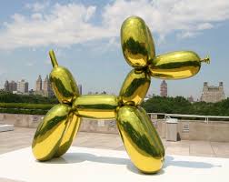
I like this photograph as I think that the manipulation of the ballon dog works well and even though it does fit in with the location it still works well. I like that the manipulation looks realistic and therefore the photograph works really well. The use of the metallic effect on the ballon dog works well because if it was see through it wouldn't work as well as this does. I really like the look of the photograph and think that it works well because it looks like it belongs in the location that it is in. 


I like this image because the composition of the image as one of the animals is looking towards that camera and the other one isn't. I like the connotations that go along with the picture, suggesting that the these animals are trapped in cages and so therefore and being held captive. I like the background of the image has been left plain to really highlight the connotations of the piece. I also think that the fact that the only bright colours in the photograph are the animals because it makes them stand out and therefore draws the viewers attention to them right away. 


I like this image because it shows high levels of contrast because the main subject of the photograph is the hulk and then there are multiple blown up animals on it. The contrast is that the animals on the hulk are happy whereas the hulk looks angry. Again the composition of the photograph is well done and the hulk is in the centre of the photograph even though the piece is at an angle. I like that the photos composition has well planned out and pre-visuialistaion has been used in order to really show off the whole of the statue. 

Thursday, 14 January 2016

Artist Research - Stephan Shore

Stephan Shore 
Born - 8th October 1947
Known for -  his images of banal scenes and objects in the United States, and for his pioneering use of color in art photography
Received -  Honorary Fellowship from The Royal Photographic Society.
His work is represented by 303 Gallery, New York, London and Berlin
He began by using a 35mm camera before moving on to colour photographs 3 years later. His next camera after a 35mm hand held camera was a 4x5" view camera before moving on to and settling on a 8x10" format camera.   


I this photo because it shows off two different landscapes in one photograph and gives the idea that one road can separate very different landscape. The composition of the shot has been well planned out and the photographer has looked at how to make sure both sides of the road are equally represented within the photograph. In this photo there are very few colours scene and they are all very natural colours that you would associate with nature and the outside. There is one man all alone in the photograph which adds to the feeling of the photograph, that the area is derelict and there is no one else there apart from the man, the photographer and the dog.  


In this photo a leading line has been used in order to capture the viewers attention and draw them in to the photograph and keep them engaged with it. The colours again are very natural and all look like they are to do with nature apart from the read and blue sign. The sign contains bright colours which have been drawn out to make them stand out  and also capture the viewers attention. The colours also stand out more due to the weather that features in the photograph as well. The composition of the photograph has been well thought out and therefore has used the contrasting colours to there full effect within the photograph.
 
 
This photo works well because it shows contrast between the plants and the phone box. The composition of this photo has been well planned out as the main subject of the photograph, the phone box and the cactus are in the centre of the photograph. Again in this photo very dull and natural colours feature within the picture. The red sign appears to be a bit worn and therefore works really well with the theme of the photograph. The use of the car at the side of the photograph gives the viewer the idea that people do use the phone box but maybe not that often as it has become worn.

Tuesday, 12 January 2016

Artist Research - Ansel Adams

Born - 20th February 1902 
Died - 22 April 1984 
Naturalist - Inspired by Yosemite National Park
Pre-Visualtion - visualising the photograph before you actually take the photograph. Something Ansel Adams was very good. 
Zone System - a photographic technique for determining optimal film exposure and development. Developed by Ansel Adams and Fred Archer. 
Main Photograph Type - Mainly took photographs in black and white. 
Group f64 - Was a group of 7 photographers from San Francisco who all shared a similar photography style. Other members included Willard Van Dyke and Edward Weston. 


This image is of a urban area and is very simple. The composition of the photo has been well planned out to show both through the arch way but to also show the top of the second building. I like that even though there isn't much landscape in this photograph however I like that you can still see the type of area in which the church is place. The lack of background gives the viewer of the photo the idea that the church is in a very rural area and is on it own in the middle of no where. The picture shows depth and uses the idea of a leading line to draw the viewer into the picture. 


This photograph clearly shows the man-made in the natural. I like that the reflection creates a leading line to the bridge and then the bridge leads you to the mountain. I like that there is so many different types of nature with the lake, trees and mountain but then the bridge is still in the middle of the photograph. This photograph shows that even in this rural area there is still human presence and really gets under the idea of rural and urban and links them together in a very simple way. 


I like that this photo is taken from up high looking down the hills showing how far down the hills go. I like the there is a leading line throughout the photograph. The leading line goes throughout the photograph and draws you all the way in. There are very subtle and the tones continue all the way through the photograph. There are many different tones in the photograph and really links the whole photo together and therefore gives the idea of depths. The use of shadows also makes the picture seem very natural and as though nothing has been changed in the image. 


Monday, 4 January 2016

Comparison Henri Cartier-Bresson and Sally Mann - Artist Research

Both Henri Cartier-Bresson and Sally Mann take photos that show a clear story with the background being blurred. I like this style of photography however there is a difference in the stories that they tell. 

Henri Cartier-Bresson tends to show the relationship between people who don't spend very long together and only see each other in passing where as Sally Mann takes photos that appear to be family member and shows a clear and strong bond between the people in her photographs. Personally I like both styles of photography however I probably prefer the style of Henri Cartier-Bresson because I like the idea of taking a photo and giving the viewer multiple different possibilities of their relationship. I like knowing that there is some kind of relationship between them but I like leaving the opinion on the relationship up to the viewer of the photograph. 


Both these photographers take their photographs in black and white. I don't always like this style of photography but it works really well in all the photographs that I have analysed. The black and white effect gives the photographs a sense of innocence and really highlights the relationship between the people in the photographs as their relationship is the focus of the photograph and not the different colours that actually feature in the photograph. The lack of colour keeps the photograph natural and keeps the focus on the relationship. 


There are many similarities and differences between these photographers and I like both their styles and I feel like the different styles really suit their own type of photography. I like both different styles and feel like they really work for the different photographers. 

Sally Mann - Artist Research

Sally Mann (born 1951) is an American photographer, best known for her large black-and-white photographs—at first of her young children, then later of landscapes suggesting decay and death. She has received many awards for her work and is one of the most well known photographers in America. 

Below are three of her photos that I have analysed. 


1984-1991

I like this photo because it is a very natural and it clearly shows the relationship between two sister and how the younger one looks up to the older one and how the older one wants to look after the younger one. I like this photo because it also shows a decisive moment because if the photo had been taken any later they may have looked different and the photograph wouldn't have looked the same. I like that the picture also sort of predicts the future were girls will get messy with their beauty products when they are getting ready, I like this because it is like the young children are role playing and pretending to be adults . 

1984-1991

I like this photo because they are not looking at the camera they are looking at the fire in the background. I like that the background is blurred but you can still what they are looking at. I like that they are not looking at the camera and this is the style of photography that I like as I don't really like posed photographs. I like that the photo is more sepia than black and white as I like the extra shade of colour included in the photograph. 

1984-1991

I like this photo because the story is very clear and again I like that you can see the relationship between the two boys and from the picture you can tell a lot about the relationship from the photo even though it is a black and white photograph. I like that even though you can tell they don't get on they are still holding hands showing that they do like each other and even love each other. 


Sunday, 3 January 2016

Henri Cartier-Bresson - Artist Research

Henri Cartier-Bresson was a French photographer considered the master of candid photography, and an early user of 35 mm film. 

Born - 22 August 1908 
Died - 3 August 2004     

Henri Cartier-Bresson created the idea of the decisive moment. This suggests that the simultaneous recognition, in a fraction of a second, of the significance of an event as well as the precise organisation of form which gives that event its proper expression. 


Henri Cartier-Bresson created Photo Documentaries of many different things. 


Below are 3 of his photos that I have analysed 


I  like this photo because the people are completely unaware that the photo is being taken and I really like that style of as I feel like it gives the photo a more natural feel to it as it is not posed or forced. I like this photo because it displays the decisive moment as if the photo had been taken a moment. I like even though the key decisive moment is in the front there is also one going on in the back because if the picture had been taken any later the car and the bike wouldn't be in the background. 


I like this photo because of the depth shown in the photo and the decisive moment is clear. I like this decisive moment is very meaningful as the children appear to be looking at a very interesting thing and the leading line in the middle makes you look all the way to the centre of the photograph not only looking at the shape of the swirl but also all of the children making up the swirl. I like this decisive moment because children are very hard to photograph and if it had been taken a second later some of the children may not have been looking at the camera and then the photo wouldn't have worked at all. 


I like this photo because it shows a clear decisive moment because any later and the person wouldn't have been crossing the bridge, the moon man not have been visible and the boat may not have been in the right place. This photo works well because it not only shows a decisive moment but because it also shows movement through the boat and the person on the bridge. 

I like all the photos however they are not the types of photos which I would take I like photo that are a part of a set and I don't feel like these all fit together even though they all show a decisive moment. I also prefer photographs that are in colour and the fact that these are in black and white may be the reason for why I don't like them. 

Thursday, 10 December 2015

Artist Research - Irving Penn

Irving Penn was an American photographer known for his fashion photography, portraits, and still lifes. Penn's career included work at Vogue magazine, and independent advertising work for clients including Issey Miyake and Clinique
    Born: June 16, 1917, Plainfield, New Jersey, United States
    Died: October 7, 2009, New York City, New York, United States

    His work is still widely shown in galleries all around the world. Penn took photos that can be catagorised into different areas of photography. 

Portraiture


Still Life 


Fashion


Personally I like the photographs that Irving Penn takes as I like the fact that he uses black and white in his photographs. I really like black and white photographs because it means that you can see all the different tones on the picture, I also think that black and white photos have a certain innocence about them as they are very plain and don't have colour to hide behind. I think these photos appear very natural due to the oak of colour featuring in the photo. I like that Irving Penn took photos from all different areas of photography and doesn't specialise in just one even though he is mainly known for taking portrait photos. I like his still life photos and the photos that he took for the fashion industry.


Monday, 30 November 2015

Portraiture - Annie Leibovitz

Annie Leibovitz was born on October 2nd 1949 in Waterbury Connecticut. In 1970 she took a job at Rolling Stone magazine. In 1983 she began working for the entertainment magazine Vanity Fair. During the late 1980s, Leibovitz started to work on a number of high-profile advertising campaigns. From the 1990s to the present, she has been publishing and exhibiting her work.


In this image you see a woman very plainly sitting in the frame however for people who know the film that the picture has a totally different meaning. The fact the the background of the photo is dark suggests that there is something darker about her and her character but the lighting on her face tends to suggest that she is trying to appear innocent however the dark background suggests otherwise. The image is very simple are portrays the simple lifestyle lead by the character in the film. 


I like the fact that this image is in black and white it really shows the simplicity and innocence of both the actor and the image. I like that the colour of the swan contrasts the colour of the actors shirt. I like that apart from the swan the rest of the picture is in very dull tones and is very linked in to each other. I feel that the fact he his showing a deadpan look and isn't really giving away any emotion. I also like the fact that he is not in the centre of the picture because it really shows off the background of the picture. 


I like that in this photo all the shades are of similar colour and all appear to be very earth and natural colours this really links the setting and the photograph together giving the picture the feel that she is supposed to be there. I like that she isn't looking at the camera and appears to be looking off into the distance. I like that this is a full body portrait but she is sitting down with one of her legs up meaning that the photographer was able to be closer in to the models face but still keep most of her body in the photo. 

Tuesday, 20 October 2015

Vivian Maier Research


In my opinion her work should be considered art because it is a different style of photography where the artist is featured in the photo which had never been seen before. It is art because the reflection add to the photo and in the top one it makes the subject stand out and even though at first you attention is drawn to the fact that she is in the photo after that you are instantly drawn to the subject of the photograph. I like these photos as the reflection really adds to the photo and gives the photo some depth. I think she has included herself in some of her photos to try and get people looking natural and not posing for the camera. I really like photos like this because these are the types of photos that I like to take, natural photos where people don't know they are the subject of the photo so therefore don't pose for the photo.


Tuesday, 13 October 2015

Bill Brandt Research

Write an account of how you respond to this image and its connotations. Is this art or sexual objectification?


Brand is associated with representing the body as a landscape or an abstract  geometric form. Working often with the female form, he is also creating images within a sexualised context in much the same was as a classical sculptor portrays a nude. The picture could be considered as both art and as sexual objectification. I think that it could be considered as art because it has been constructed to show exactly what needs to be shown and has been heavily edited to create the exact feeling that Bill Brandt wished to portray. However it could also be considered as sexual objectification as it is just of the womans legs and doesn't show her face or anything that would give her meaning as far as the viewer is concerned the woman in the photo is just a pair of legs and the fact the nothing else of the shown suggests that she doesn't matter and is just another object in the photograph. it can be interpreted in either way, I look at the photo as a piece of art because I am a photography student and this is how every photo must be looked at however if someone with no knowledge of art or photograph looked at this photo they may look at it as the women has been sexually objectified. The image uses negative semantic space at the top right hand corner of the photo and i feel that this has been used to really show of the light tone of skin on her knee just below it. The different tones in this photo really makes the legs stand out and this may also contribute to a person feeling that in this image the woman is being sexually objectified.