Tuesday, 15 December 2015

Definition Post - Photo Documentary

Photo documentary usually refers to a popular form of photography used to chronicle both significant and relevant to history and historical events and everyday life. These photos tell a story. 


This photo documents the movement of the man and the ball and tells a clear story of what is happening .


This photo show the story of the children and gives the idea that they are trapped somewhere they don't want to be. This is shown through the fact that they are standing behind the barbed wire. 


In this photo a key moment is being documented as the little boy concentrates on not hurting himself as he falls down. This is a key moment as you can see how no one has noticed that he is falling over 


In this photo the photo is documenting the couple walking out of the church after their wedding. This is a really happy moment and allows them to look back on it a remember the moment well.

Personal defintion - A series of photos that tell a story over a period of time.

Thursday, 10 December 2015

Portraiture Retouching


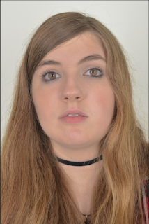
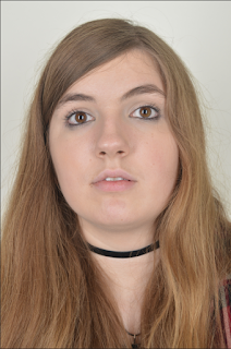
 In the photo on the right I have applied a soft focus to the photo to the retouch the skin of the model 
Below are the step for how to do this 
1.   Open photo
     2.   Image – Mode – CMYK Colour – Ok -
3.   Channels – Yellow
4.   CMD- A
5.   CMD- C
6.   Go back to layer
  7.   CMD-Z to original image
8.   CMD-V
9.   Rename Layer Flaws
10.  CMD-I
11.  Blending mode to soft light
12. Press alt-K and then circle in rectangle at bottom of screen
13. Select a soft brush
14.  Adjust Opacity

15.  Apply to Image make sure the colour is set to white


In the photo on the right I have used 
the spot healing tool to get rid of blemishes and imperfections 
Below are the steps on how to do this. 
 1.   Open Image
2.   Alt-J to duplicate layer
3.   Rename Layer – Blemishes
4.   Select the spot healing tool
5.   Apply to blemishes and
 imperfections


Here is the photo with both these effect applied 


I really like the effects that these had on the picture. I like that it changed the eye colour and that the effect that it has had on the face. I like that it made the skin equal and look soft. I like the editing on the face as it doesn't look fact but you can tell that it has been edited. The processes look very difficult however once you have got the hang of them they are easy and are very quick to apply. Originally I didn't like the idea of doing this process but after seeing how well it worked I feel like it will work better with some of my photos. 

Artist Research - Irving Penn

Irving Penn was an American photographer known for his fashion photography, portraits, and still lifes. Penn's career included work at Vogue magazine, and independent advertising work for clients including Issey Miyake and Clinique
    BornJune 16, 1917, Plainfield, New Jersey, United States
    DiedOctober 7, 2009, New York City, New York, United States

    His work is still widely shown in galleries all around the world. Penn took photos that can be catagorised into different areas of photography. 

Portraiture


Still Life 


Fashion


Personally I like the photographs that Irving Penn takes as I like the fact that he uses black and white in his photographs. I really like black and white photographs because it means that you can see all the different tones on the picture, I also think that black and white photos have a certain innocence about them as they are very plain and don't have colour to hide behind. I think these photos appear very natural due to the oak of colour featuring in the photo. I like that Irving Penn took photos from all different areas of photography and doesn't specialise in just one even though he is mainly known for taking portrait photos. I like his still life photos and the photos that he took for the fashion industry.


Tuesday, 8 December 2015

Contact Sheet - Texture

Work Diary - Texture

In todays lesson we where continuing to work on our Unit 1 blogs and I decided that I was going to reshoot texture. I decided to reshoot this formal element because I was ill at the time that this was shoot at college, I also felt that texture was my weakest of the formal elements and I felt that now having studied all of the formal element I was in a better place in which to take more texture photos.

Below is a photo from the shoot that I like. 
Camera Settings- 1/15 sec f/4.5 ISO 3200 

I like this photo because there are multiple different textures shown within the picture and it clearly showed off the texture on the beanbag. I like the photo as it is edited and turned in to black and white. The black and white shows off the different texture due to the different tones featured in the photo.

Below is a photo from the shoot that I don't like 


I don't like this photo because it doesn't show off the texture that was actually there at the time I also don't like the fact that the background is different colours I fell like this photo would have worked better if I hadn't have been standing on a table in order to take this photo. 

Progression 

If I were to go out and re do this shoot I would like to do this shoot then it isn't raining as I would like to shoot this outside because I don't have that many photos from outside. 

Image result for texture photography\

Image result for texture photography

Image result for texture photography

Thursday, 3 December 2015

Straight Images - Multiple Imagery


Contact Sheet - Multiple Imagery


Work Diary - Mulitple Imagery

I really liked this type of photography and really wanted to try it, I started off by working in the studio on images for these photos and then I edited it when I was at home having really liked how they came out I decided to continue to shoot images for this in Thursdays afternoon lesson. I spent a lot of time editing these photos and picking exactly which photos I wanted to included in the multiple imagery image. 

Below is an Image that I created that I like 


I really like this image that I created because I feel like all the images work really well together. The images work really well together and I like how simple the images are and how the simple use of a prop can influence the photos. I like the photos are posed and that my model really used the hat as a influxes on her facial expressions. I like that I only left a small gap in-between the photos because I feel that they are all different and are a set however they aren't the same photo they needed a little gap in the middle of them to show off the difference between the photos.


Below is an image that I created that I don't really like

I don't like this photo because the change between table and white backdrop is not straight and is at a different heights in every photo. I don't like that the photos are from a different angle and I don't like the fact the photos are taken at different heights as they show different parts of the shoes. I like the idea of the photo but it just wasn't executed well and I think I could have used a tripod to make these photos better.

Progression 

If I were to reshoot multiple imagery I would shot multiple different people in the studio all with the same facial expression. I would also like to shoot outside and try to make something like a flower or a plant out of the different images. I would also like to look at larger multiple imagery with more than 9 images in them.


Image Bank - Multiple Imagery


I like this image because the image is exactly the same photo but the eye colour has been manipulated in order to show off the eye and really highlight the different colours. This multiple imagery doesn't tell a story but it does show a lot of different techniques. I like that no gap has been left between each and shows that it is exactly the same photo. I like this because it show continuity between the photos. 


I like this image because all the lips are different and are on different people in different light with different zoom however they work really together. The design is very simple and I like that a small gap has been left to show that it is a different range of photo. I like the fact that they are all different yet are able to link together in a clear way. 


I like both of these images because they are all photos of the same thing from different angles. I like that it is clear and it really shows off the subject of the photo. I also like that even though the whole subject isn't in the photograph from the layout of the images you can tell exactly what is being photographed and it is clear that the placement of the image bass been well planned and clearly thought out. 


I like this image because the subject of the photo and the individual photos are all very simple and really link together well. I like that even though the image doesn't make a tree and doesn't look like an actual tree. I like that even though it doesn't look like a tree it does resemble a tree slightly because the branches get less and less in the top of the image and the trunk is clearly shown in the bottom row of photos. 


I like this image because I feel like you can really appreciate all of the different parts of her face. I like how the photographer has used 5 images including skin and 4 which don't and has arranged them in a clear pattern. I like that you can clearly see all of her and you are drawn to the image because the face fonts look quite right and is really shown off through the placement of the images.